FromWord
Cohen Capital Holding
Transforming investment vision and strategy into a solid, clear, distinctive brand identity and bring this concept to life through a dedicated website.
Client:
Cohen Capital Holding
Year:
2025
Service:
Brand Identity & Web design
Timeline:
1 month
The concept, on a business card
Translating the authority and reliability of Cohen Capital Holding into a visual identity system that conveys solidity without feeling distant, and dynamism without losing balance. Through essential typography, a sophisticated color palette, and a design that balances precision and visual impact, we have built a visual language that communicates security, foresight, and concreteness.

The Logo
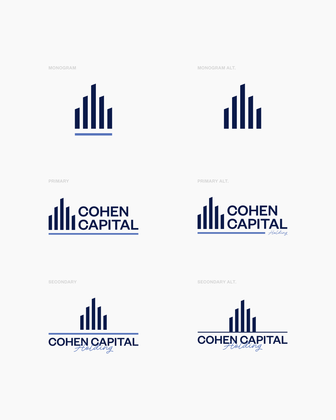
A graphic symbol that communicates authority without rigidity, built on principles of balance and modularity. The Cohen Capital Holding logo strikes a balance between solidity and dynamism through essential shapes and authoritative typography. Its geometric design evokes stability and growth, while the color palette conveys trust and strategy. Designed to adapt across all touchpoints, the brand reflects the holding’s pragmatic and structured vision, ensuring long-term recognition.


The Brand’s Digital Presence
The branding of Cohen Capital Holding comes to life on the website through a clean, institutional design. Structured layouts, authoritative typography, and a sophisticated color palette guide the user through a clear and immersive experience. The visual identity adapts consistently, reinforcing the perception of the holding’s solidity and reliability.

Continuity and Consistency
Cohen Capital Holding’s color palette combines sophisticated and institutional tones, conveying authority and strategic vision. Applied to stationery, it strengthens the brand identity through refined materials, precise typographic details, and elegant finishes. Every element—from business cards to official documents—reflects coherence, professionalism, and meticulous attention to detail.


Latest projects


